case study #2
case study #2
plutopay app
the goal of this project was to build a responsive e-wallet web app, incorporating 3 main features: the onboarding flow, move money between financial spaces, and send money to other users.
role: product designer
duration: 2 weeks
platform: ios, android, web
tools: figma, figjam, miro
place: careerfoundry
project summary
plutopay is a digital wallet app designed for secure money transfers, budget management, and financial organization without the need for physical bank visits. aimed at tech-savvy individuals aged 18-45, the app offers a seamless, feature-rich experience catering to modern financial needs.
✹ ✹ ✹
the interviews revealed common pain points related to managing multiple payment methods, tracking spending, and security concerns. participants expressed interest in features like peer-to-peer transfers, budgeting tools, and security.
key learnings:
1. users value simplicity, speed, and security in payment solutions.
2. budgeting tools and spending-tracking features are in high demand.
3. peer-to-peer payments are a desired functionality.
4. understanding user behavior across different age groups is crucial for product development.
user interviews
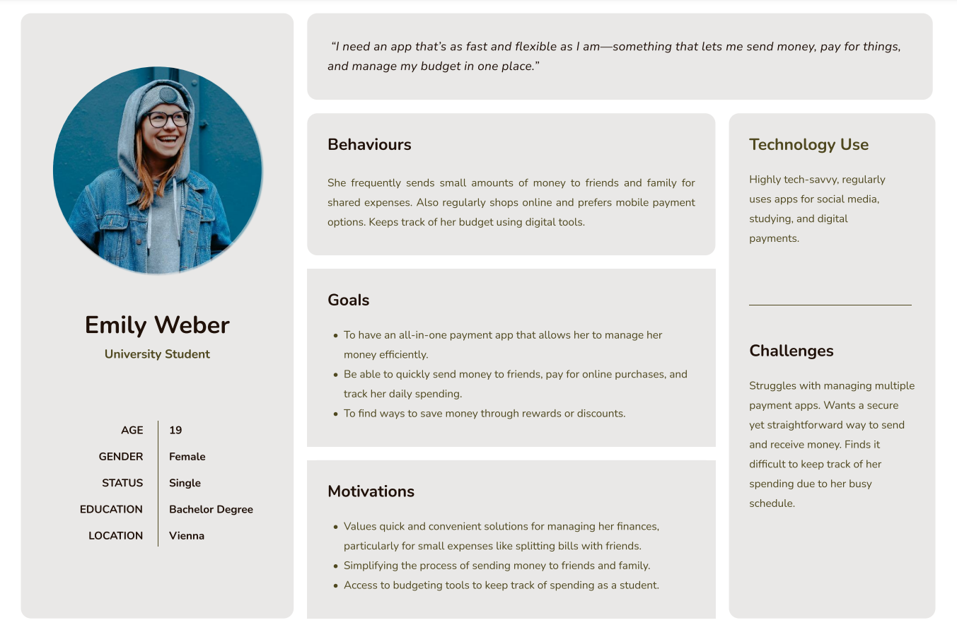
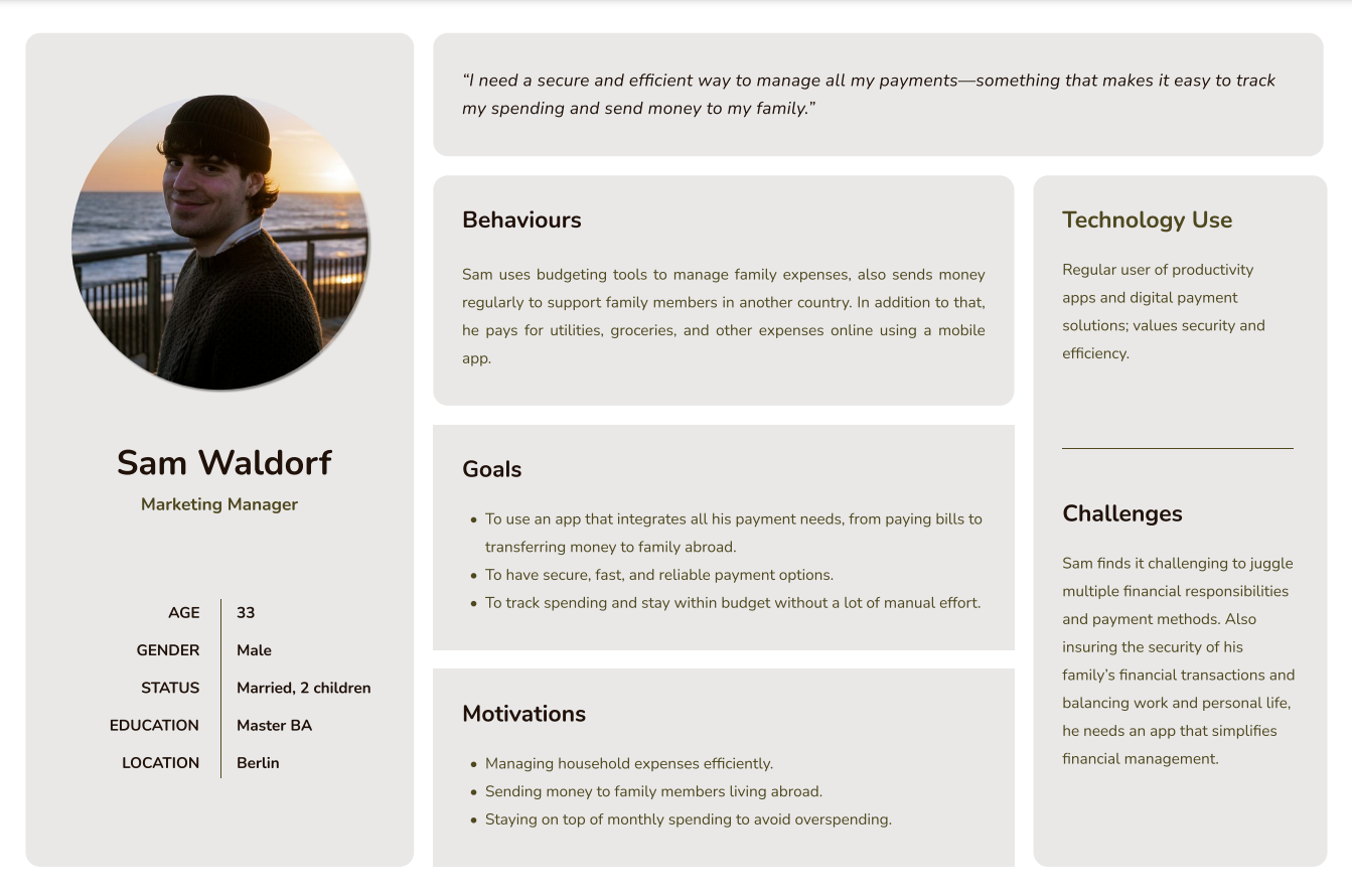
based on user research, i developed two distinct personas to guide the plutopay project. persona 1: emily weber. emily is a tech-savvy university student who frequently uses digital payment solutions for her daily expenses. persona 2: sam waldorf. sam is a working professional and family man who manages household expenses and saves money. his persona emphasizes the importance of security, efficiency, and ease of use in managing his financial transactions.
i addressed diverse financial needs, such as emily’s quick access for social expenses and sam’s organized approach for family budgeting and savings.
user personas
✹ ✹ ✹
emily and sam require an intuitive, secure platform that aligns with their financial goals. specifically, users need a reliable way to send and receive money, track spending, and manage their savings without feeling overwhelmed or uncertain about security.
problem statement
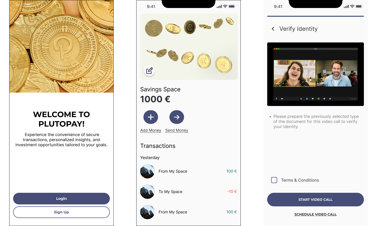
easy onboarding and verification process.
an intuitive money transfer experience with clear confirmation feedback.
an easy-to-navigate savings feature to support financial goals.
solution goals
these user flows were designed to enhance user efficiency and reduce navigation friction.
user flows
the following flows were created to map the user’s journey:
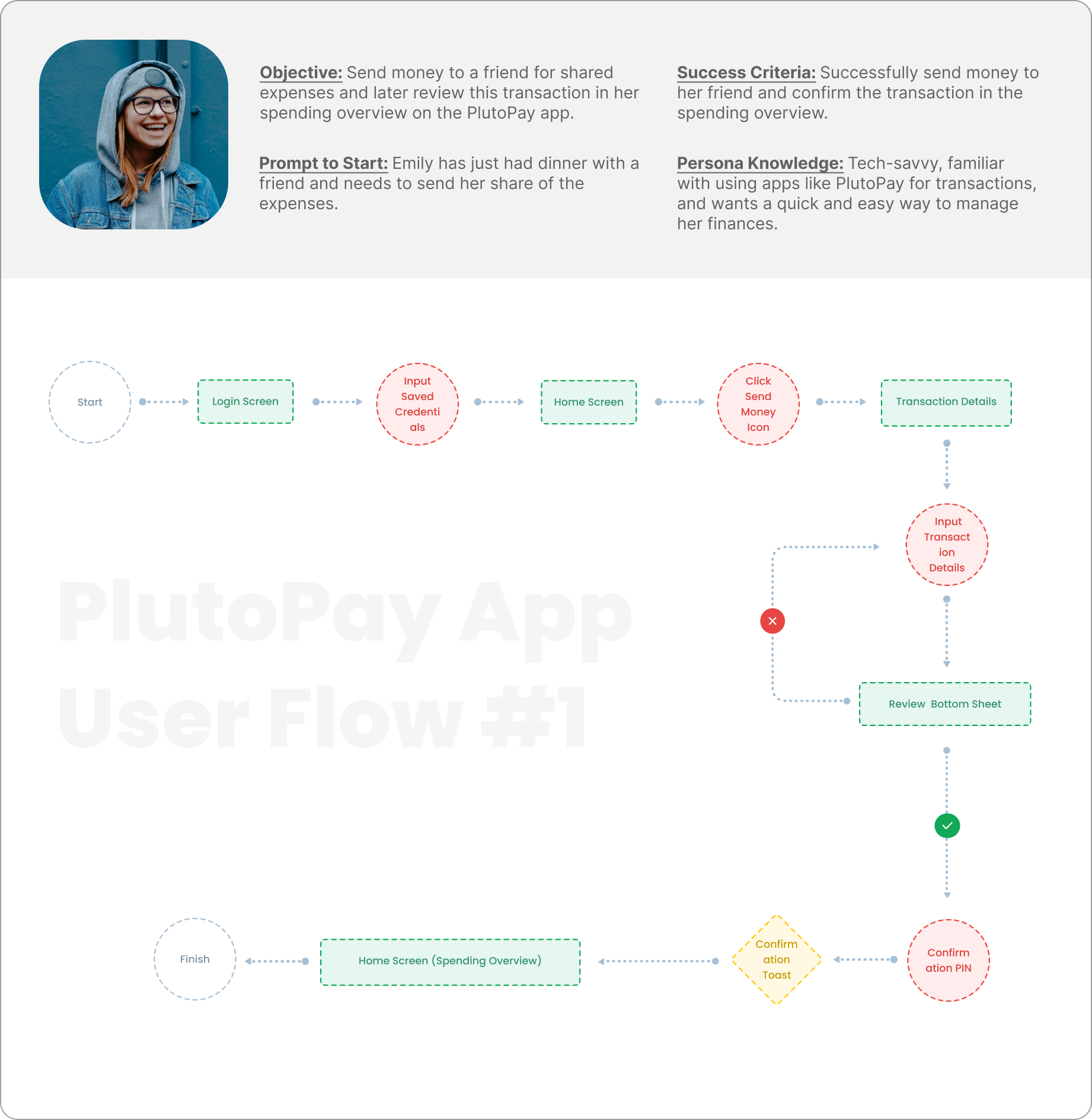
#1 sending money to a friend for shared expenses.
objective: efficiently send money with confirmation of the transaction.
steps: Login → saved credentials → home → send money → transaction details → review → confirmation → spending overview
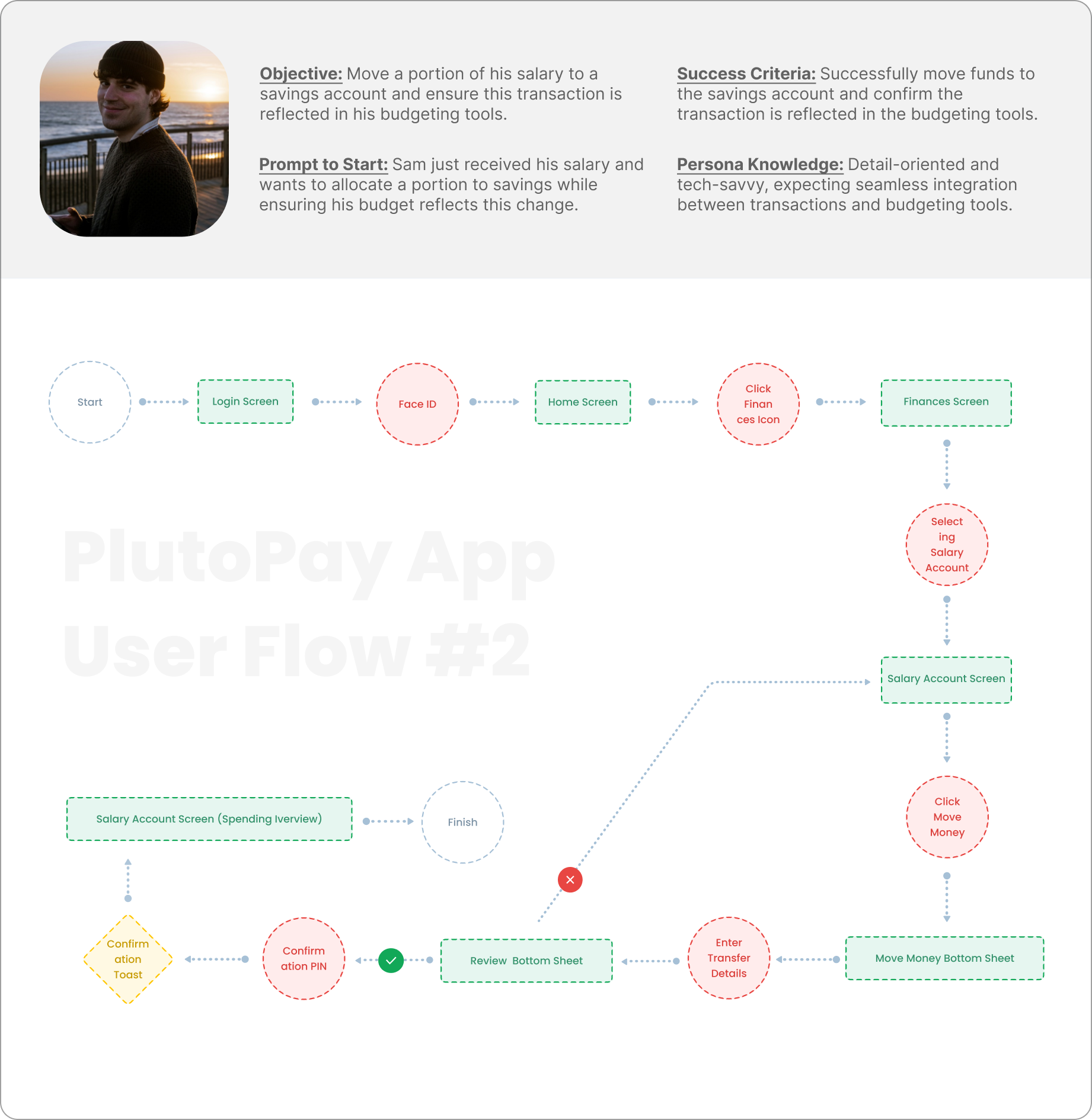
#2 moving a portion of salary to a savings account.
objective: seamlessly allocate funds with budgeting integration.
steps: login → face id → home → finances → select salary account → move money → review → confirmation → spending overview.
✹ ✹ ✹
building mobile wireframes
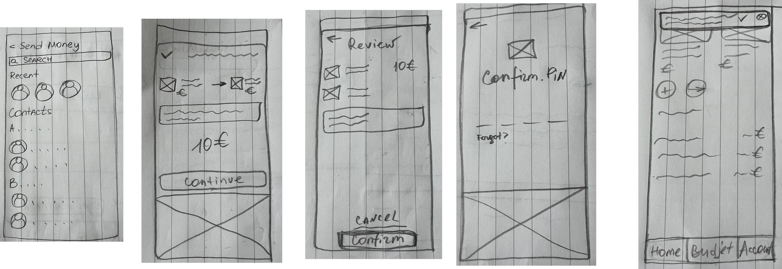
low-fidelity send money wireframes: streamlined for speed and simplicity, allowing users to select contacts and input transaction details in a few steps.
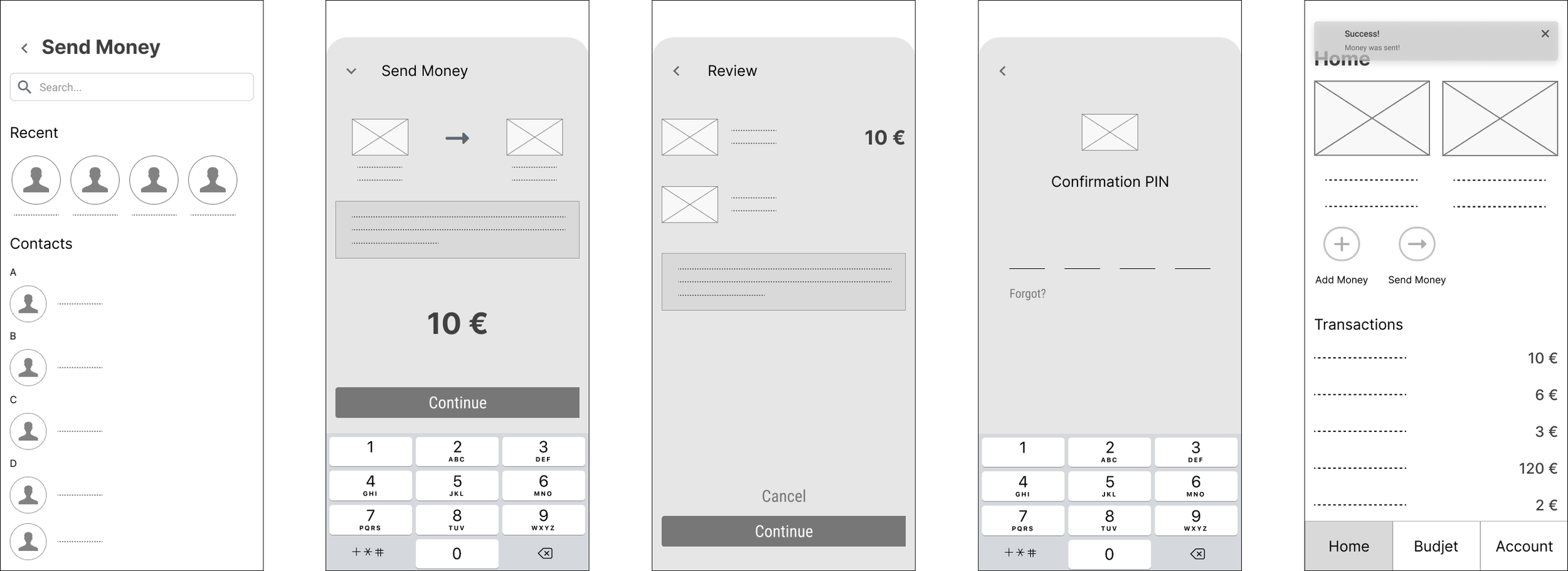
mid-fidelity send money wireframes: more clear and detailed version.
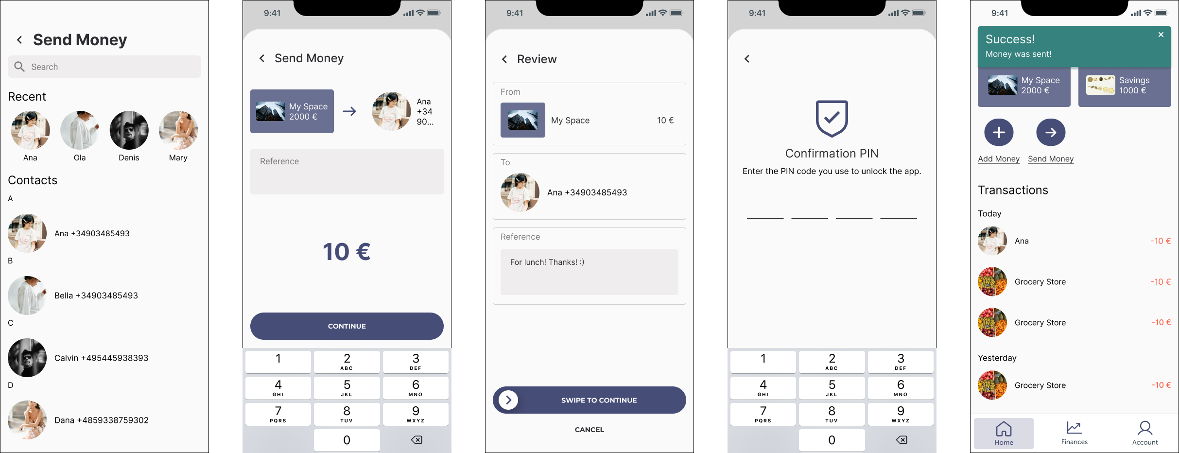
hi-fidelity send money wireframes: added slide-to-confirm interaction for intuitive confirmation.
building web wireframes
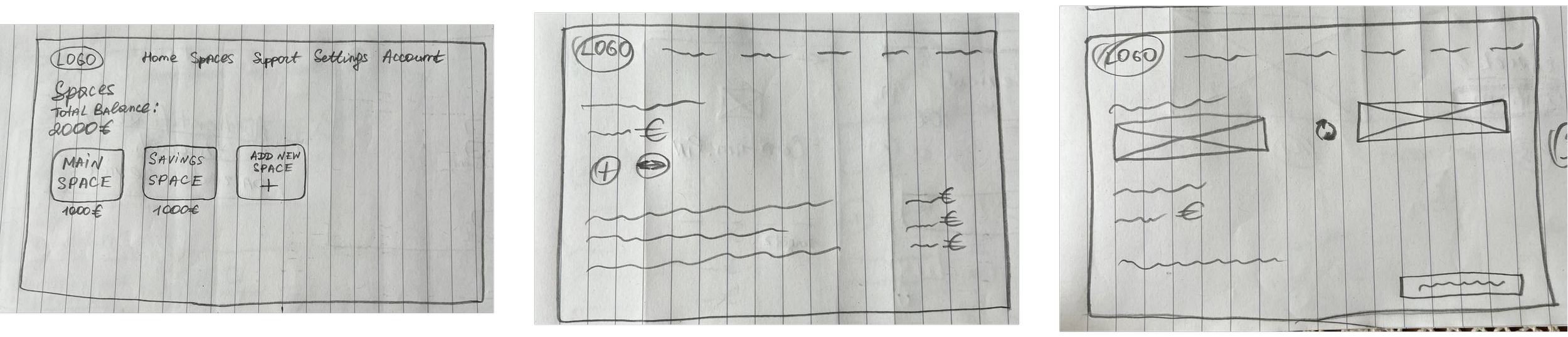
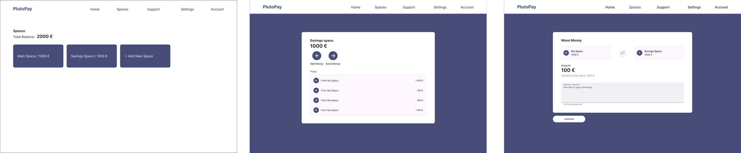
web low- and hi-fidelity move money wireframes: supported financial goals with features to move money into savings. integrated reverse action button and material design components to enhance usability.
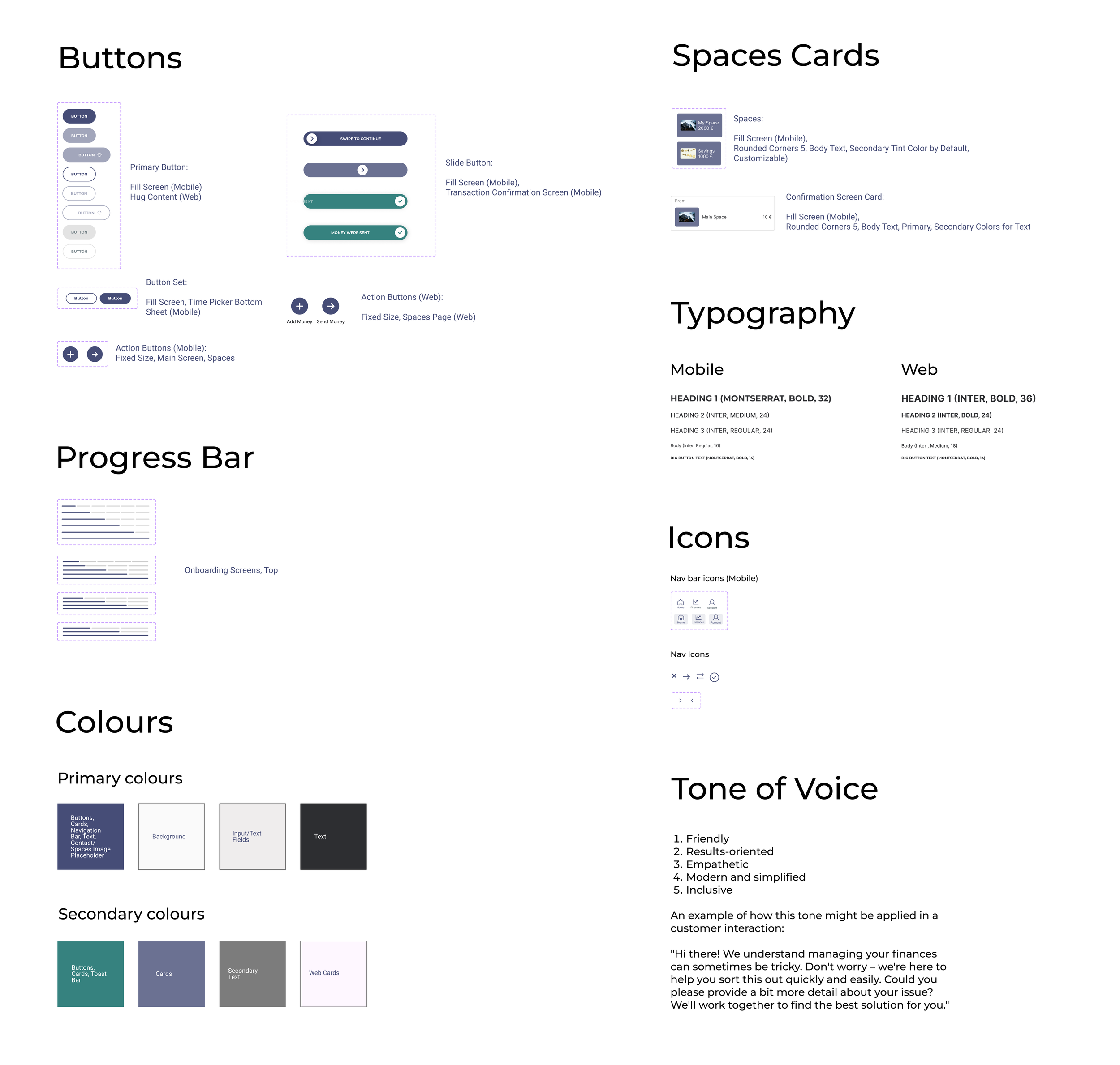
the style guide shown here was selected to create a cohesive, user-friendly experience in the plutopay app.
the variety of button styles (primary, action, and slide) ensures that users can easily identify different actions.
the spaces and confirmation cards use rounded corners and customizability giving users a sense of ease and personalization
the progress bar’s placement at the top of the onboarding screens offers clear visual feedback, helping users track their progression through the setup.
the typography choice (montserrat and inter fonts) with different font weights and sizes for mobile and web, ensures readability and accessibility across devices, reflecting approachable brand identity.
simple and clear icons help users navigate easily without overwhelming them with too much text.
the primary and secondary color schemes have been carefully chosen to balance usability and brand aesthetics.
the tone of voice guidelines reflect a friendly, empathetic, and inclusive brand personality.
✹ ✹ ✹
my role: i designed and moderated usability tests for both mobile and web prototypes to evaluate the effectiveness and user satisfaction of plutopay's core functionalities.
timeline: 2 weeks for testing and iterations.
platform and tools: figma, zoom, otter.ai
participants: 6 participants (3 for web, 3 for mobile), including tech-savvy users, professionals, and designers, aged 27–40.
key findings:
users struggled with locating the pin verification data during onboarding.
lack of a search option in the nationality selection dropdown component.
the button for switching between spaces lacked visibility and clarity.
users expressed a need for flexibility in scheduling the identity verification call.
based on these findings, I proposed several solutions, including:
adding clear instructions on the pin screen
implementing a search feature for the nationality dropdown component
enlarging and making the reverse arrows icon interactive
creating a scheduling option for video verification
usability testing
✹ ✹ ✹
iterating and refining a design for hand-off
accessibility review (wcag standarts):
improved the input fields contrast;
did color enhancements for password tips and video call descriptions;
changed the size of the progress bar for better visibility;
increased time picker bottom sheet contrast;
polished hierarchical structure for screen readers.
1) send money mobile prototype
✹ ✹ ✹
conclusion and reflection
this project was a valuable learning experience that allowed me to delve deeper into designing for financial technology.
what went well:
user feedback highlighted the intuitive flow of the onboarding and money management features.
the implementation of material design principles improved the visual appeal and accessibility of the interface.
what didn’t go as planned:
i faced challenges aligning typography and spacing across desktop screens, which required multiple iterations.
the onboarding process initially lacked clarity during usability testing, particularly during the verification process.
overall reflection:
this project strengthened my skills in user research and accessibility. the iterative nature of design became evident, reminding me of the importance of usability testing in shaping a product. moving forward, I aim to incorporate more user feedback earlier in the design process and experiment with advanced prototyping tools to simulate real-world interactions.