case study #1
case study #1
designing a new financial feature for the hopper app
the app focused on travel bookings, lacked complementary financial features, which limited long-term user engagement and caused missed opportunities for additional revenue. the challenge was to explore ways to integrate financial add-ons that drive both user value and business growth
role: ui/ux designer
duration: 2 weeks
platform: ios / android
tools: figma, figjam, canva
hopper app
hooper is a travel app designed to help users plan and book trips efficiently. while the app streamlined bookings, data revealed that many users struggled to stay financially prepared for future travels, creating a missed opportunity for deeper engagement and additional revenue.
quantitative & qualitative data
at the beginning, i’ve conducted an interview with 3 main stakeholders from the hopper app, and surveyed 20 hopper users. here is what i’ve found out:
most of hopper users are young, between 18-25 y.o. they live in canada or america and feel the lack of money for travelling;
therefore users expressed the need to save money for travel seamlessly and effectively;
more than 55% of users were positive about saving money for travel with the hopper app;
users prefer clear, tangible benefits rather than complex reward systems.
integration with real bank accounts could open partnerships with financial institution;
business potential for cross-selling or upselling trips once users save within the app.
✹ ✹ ✹
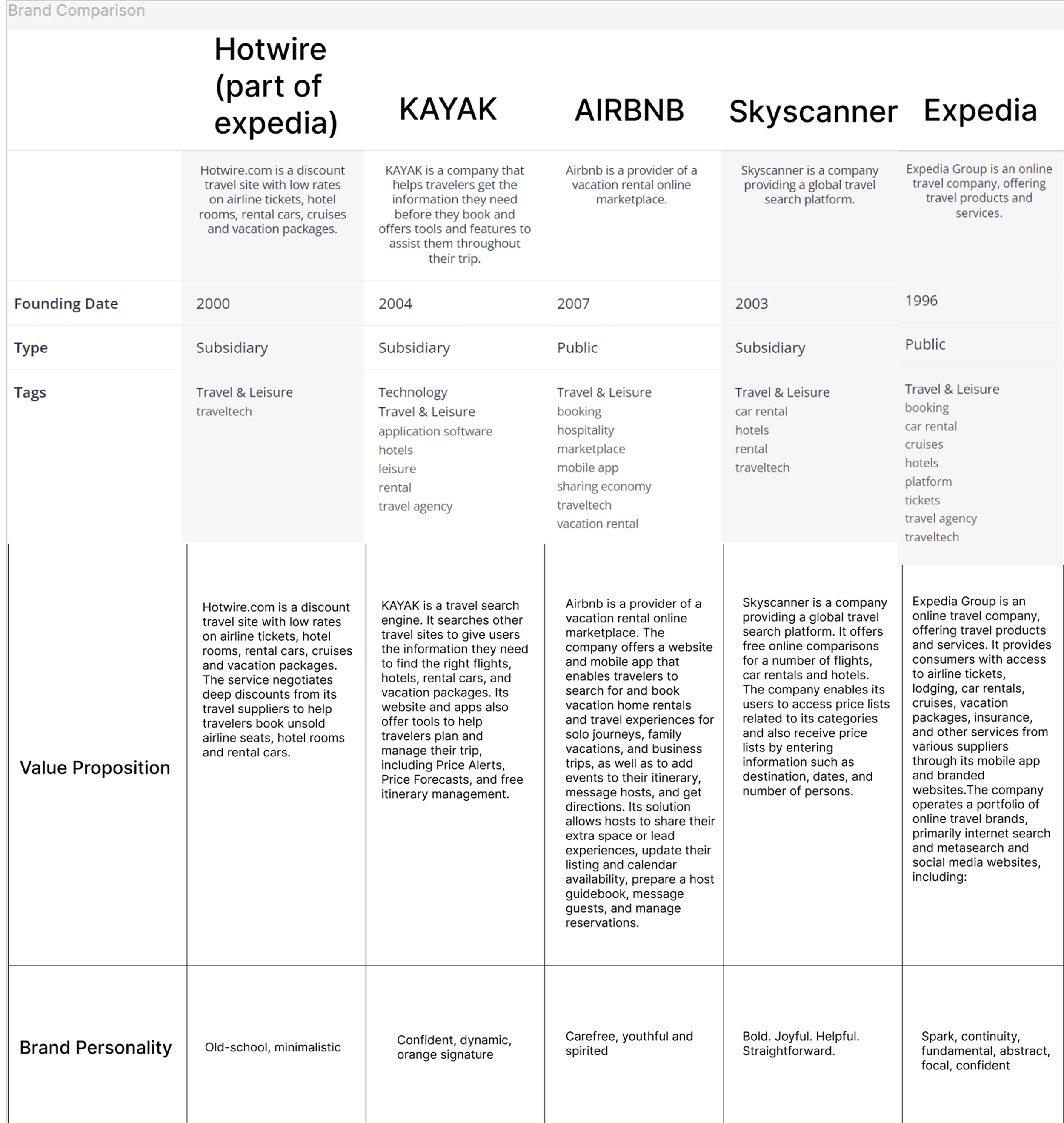
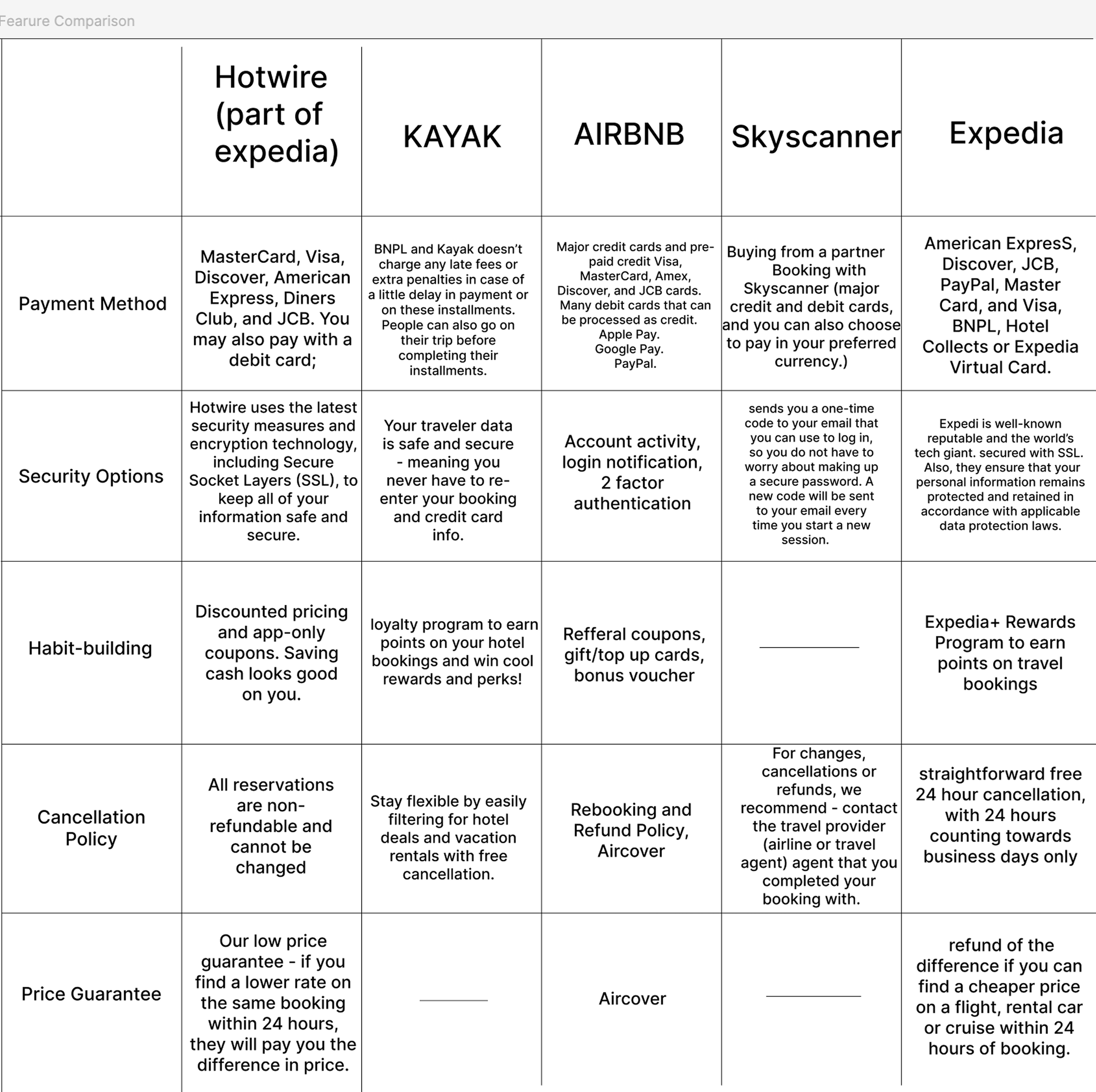
competitive analysis
i analyzed hotwire,kayak, airbnb, skyscanner, and expedia focusing on payment methods, security, loyalty mechanics, cancellation policies, and price guarantees.
key findings:
hopper competitors had in-app features which helped users collect incentives and money and keep them safely within the app;
security is expected, not differentiating;
habit-building relies on loyalty programs. rewards points, referrals, and discounts dominate, but they incentivize repeat bookings rather than smarter financial decisions
opportunity for hopper:
become a booking platform with a travel financial assistant, offering proactive savings tools and the ability to travel cheaper without compromising quality.
once the research stage was complete, i conducted the brainstorm session with the hooper’s senior product designer and 2 developers, where we identified top 4 focus areas for developing the new financial feature and prioritised them based on impact/effort ratio:
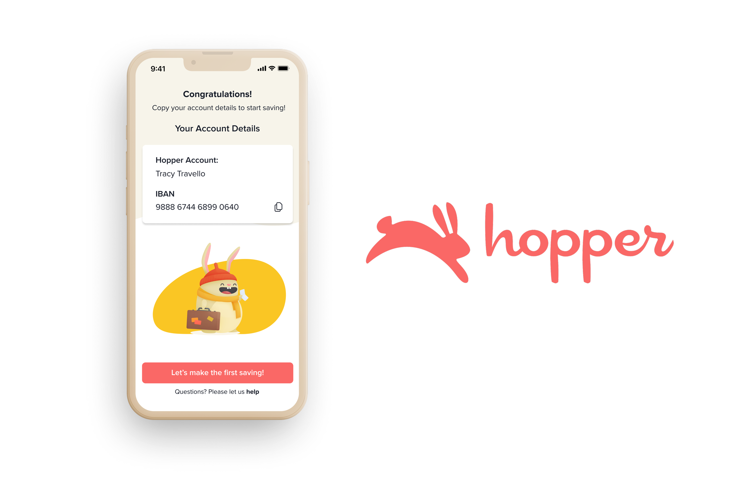
1) seamless introduction and onboarding to the financial feature;
2) flexible, trustworthy savings space;
3) clear communication of real benefits;
4) integration of savings with upcoming trips, incentives, and deals.
✹ ✹ ✹
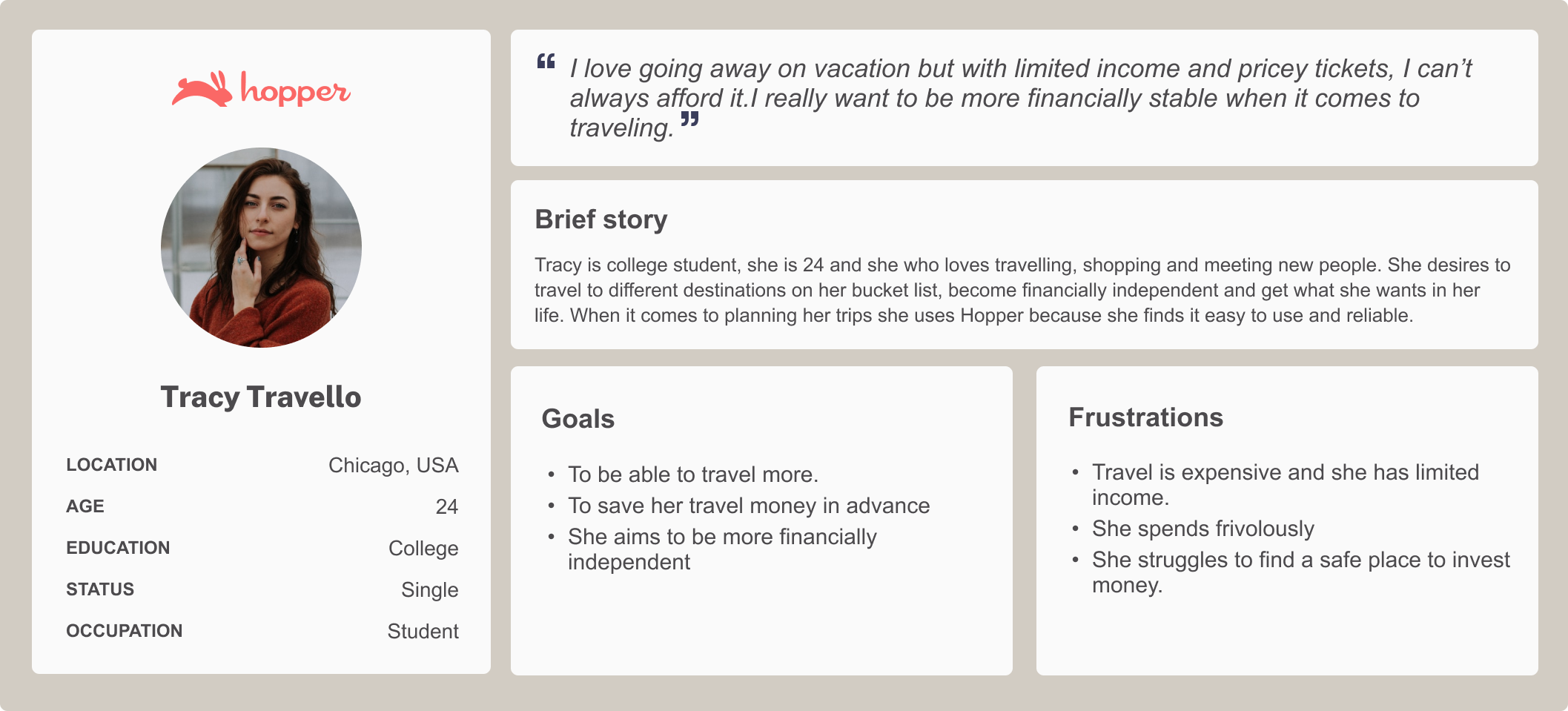
user persona + problem statement
tracy trello. she is a 24-year-old student, a loyal hopper user and she wants to travel during the upcoming summer holidays. she wants to be able to save her money in advance and travel more. she has limited income and when she finally has money she spends it frivolously.
problem statement - “travelers who use hopper need to find a way to save money safely for their upcoming trips because saving money will help them to have desirable vacations”
✹ ✹ ✹
lo-fi wireframes
i concept-tested all built-from-scratch lo-fi wireframes and based on the feedback:
added interest calculator with graphs;
moved trustworthy elements upfront;
made screens more structured and clean, maintaining informational hierarchy;
re-organized main buttons so users can find them easily.
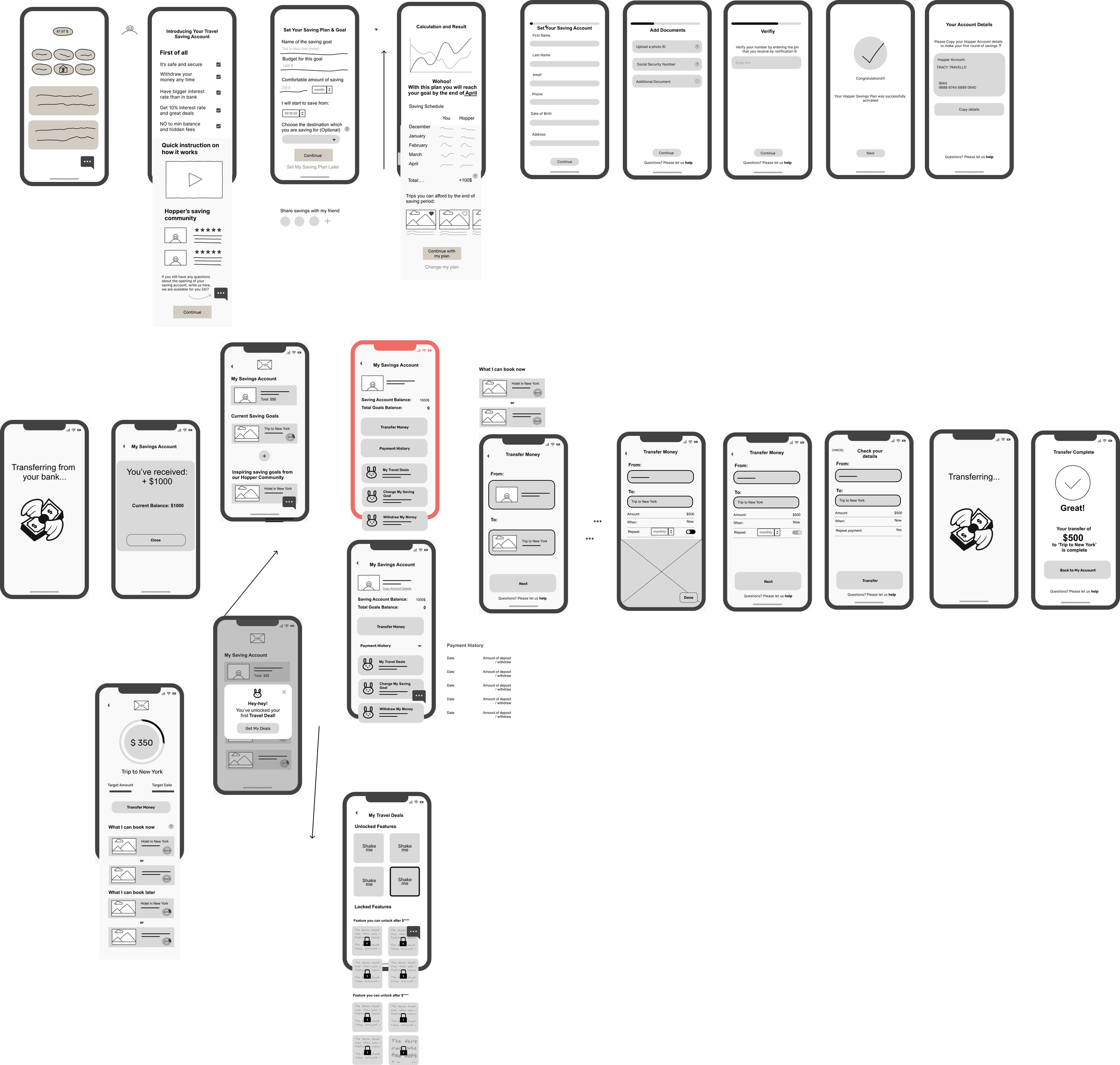
mid-fi wireframes
i made the first round of improvements, designed mid screens, tested them with figma prototyping tool, and continued with style tile alignment before building hi-fi wireframes.
✹ ✹ ✹
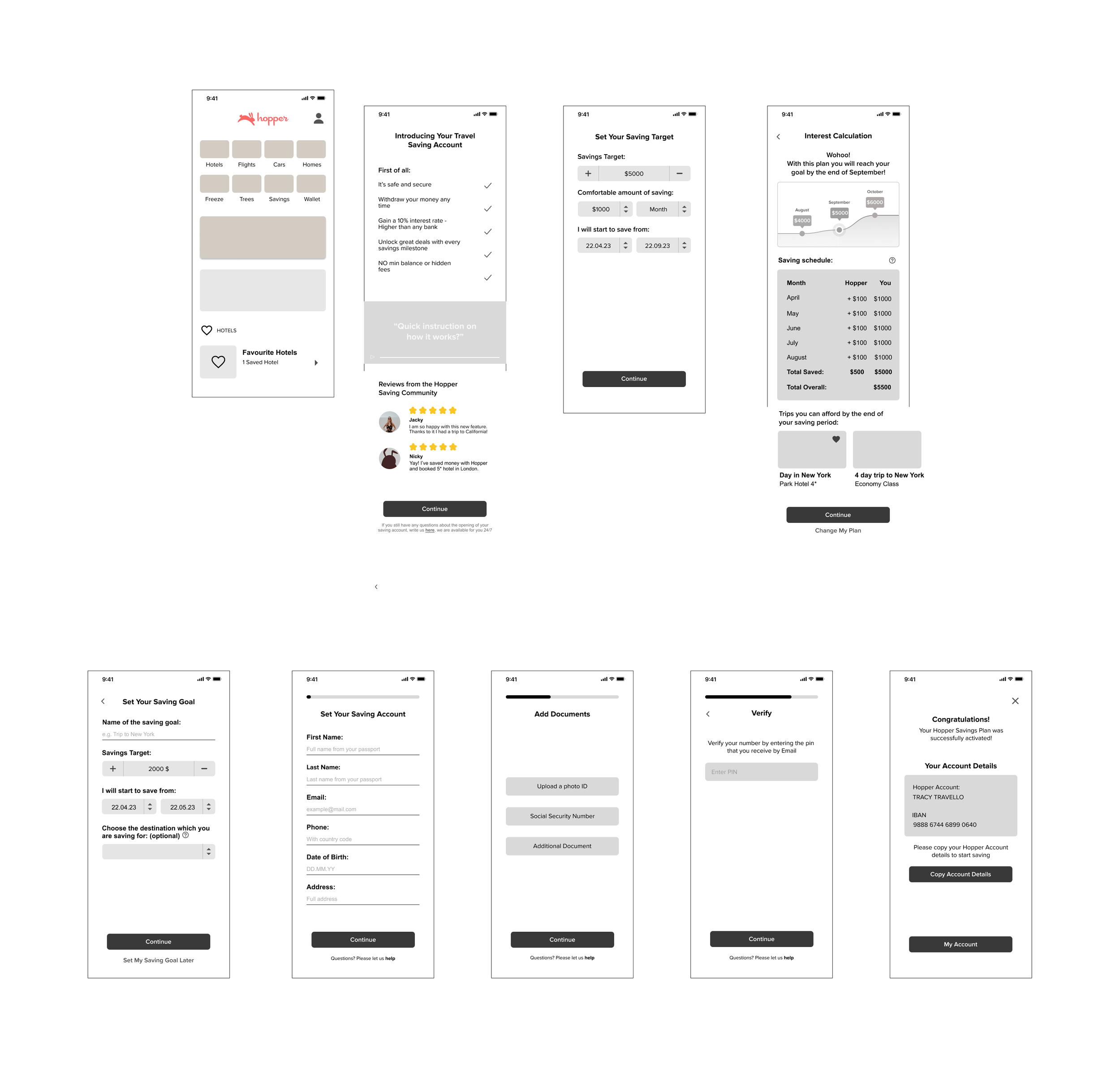
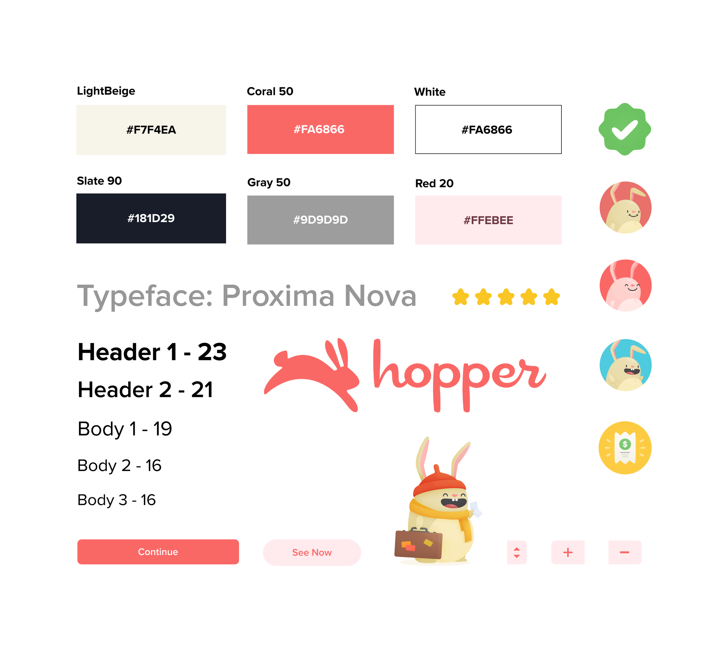
style tile
i took all the elements from the existing design system and proceeded with the hi-fi wireframes.
here we have pastel and accent colors, hopper’s typeface - proxima nova, which works very well on the web and is very adaptable to different design directions. i also used existing buttons, logo, and illustrations with the main brand character - bunny.
✹ ✹ ✹
prototypes #1 & #2
this development cycle in a cross-functional team has proved that the design thinking is an imporatnt key to uncover real user needs in a methodological way, while maintaining smooth workflow continuity.
close collaboration with pm’s, developers, and other stakeholders improves solution quality, for example, highlighting the possibility of showing the recommendations and deals once the user sets the savings goal or saved the money or effective prioritisation of tasks, based on impact and effort/feasibility - insights I wouldn’t have found alone.
also balancing user desirability, feasibility, and business impact is challenging but achievable when everyone knows their role in the project, keep documantation clean, and maintains no-ego communications.
combination of qualitative research, quantitative data, and competitor research provides a solid foundation (of course, the more data the better, but these 3 are already a great starting point for the design process), and without them, building a profitable, user-centered solution is nearly impossible
next steps
evaluate the impact of the newly implemented financial feature and implement the necessary feature improvements;
business request: add an opportunity to share savings with friends.