case study #3
case study #3
vaha mirror website redesign | e-commerce
the goal was to redesign the end-to-end user flow to improve conversion by simplifying checkout, clarifying product value, with a target of +20% revenue growth.
role: ui/ux designer
duration: 7 days
type: responsive website
tools: figma, figjam
context and initial research
vaha sells a premium smart fitness mirror with a high price point and a complex value proposition (hardware + subscription + training ecosystem). initial stakeholder + user interviews and swot analysis i conducted highlighted that the existing purchase flow has frictions:
users struggled to understand what they get for the price
checkout felt long and cognitively heavy
key trust signals appeared too late in the flow, and the website's ui lacks a clean hierarchy.
as a result, users dropped off before completing the purchase, especially on the checkout and confirmation steps.
✹ ✹ ✹
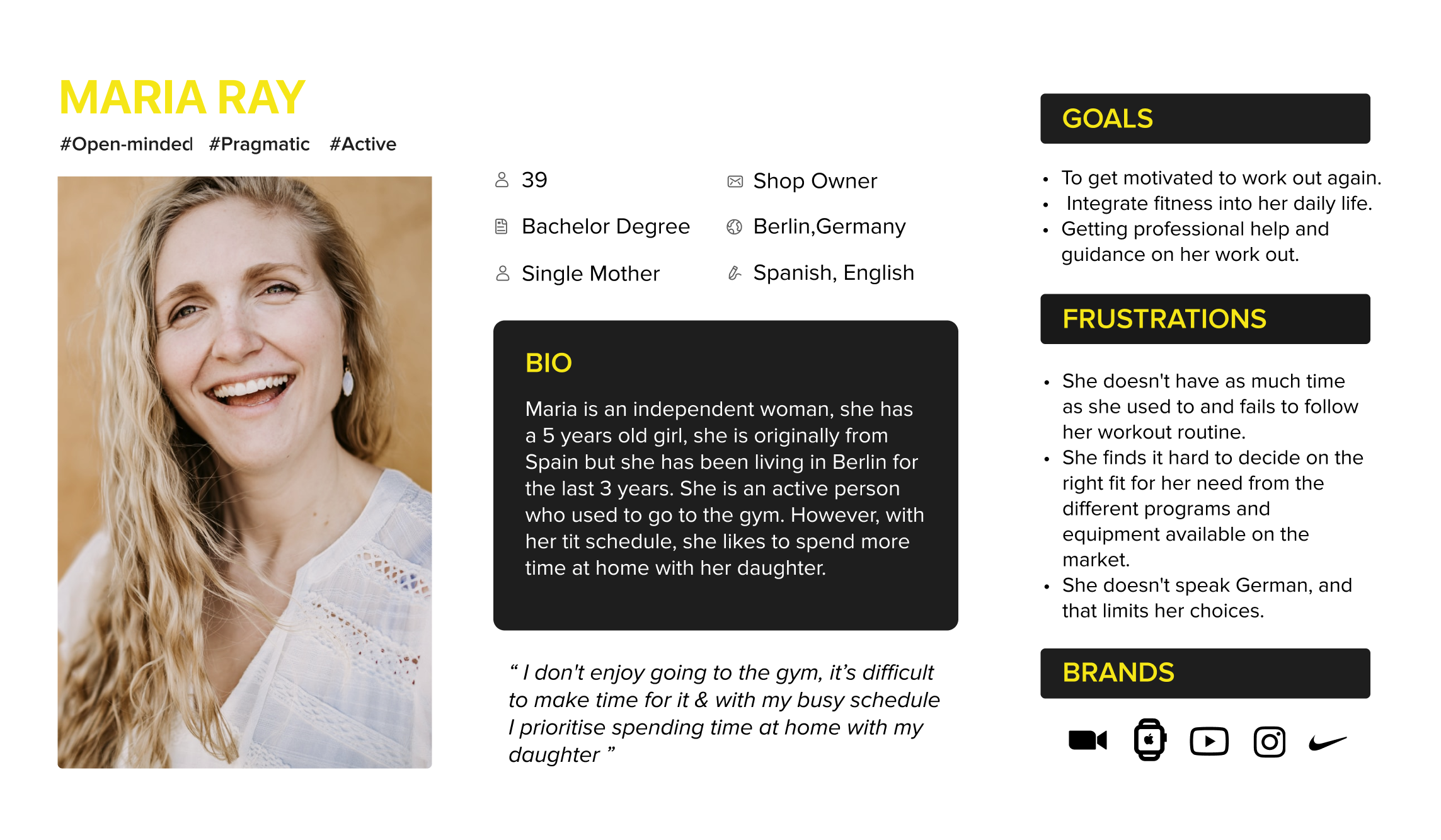
user persona
after conducting initial research, the next step was to create a user persona to better understand and empathize with our primary user, maria. she’s an active entrepreneur interested in investing in her health, but also busy with raising her child and cautious about making high-value online purchases. while exploring the vaha website, maria’s buying experience didn’t feel seamless. she became uncertain at the checkout stage due to unclear pricing details and a lack of trust signals, which led her to drop off before completing the purchase. this pattern revealed a broader business issue: many potential customers experienced similar friction during checkout, directly impacting conversions and sales.
problem statement - how might we increase checkout completion and user confidence for a high-ticket fitness product by reducing friction and clearly communicating value at every step of the journey?
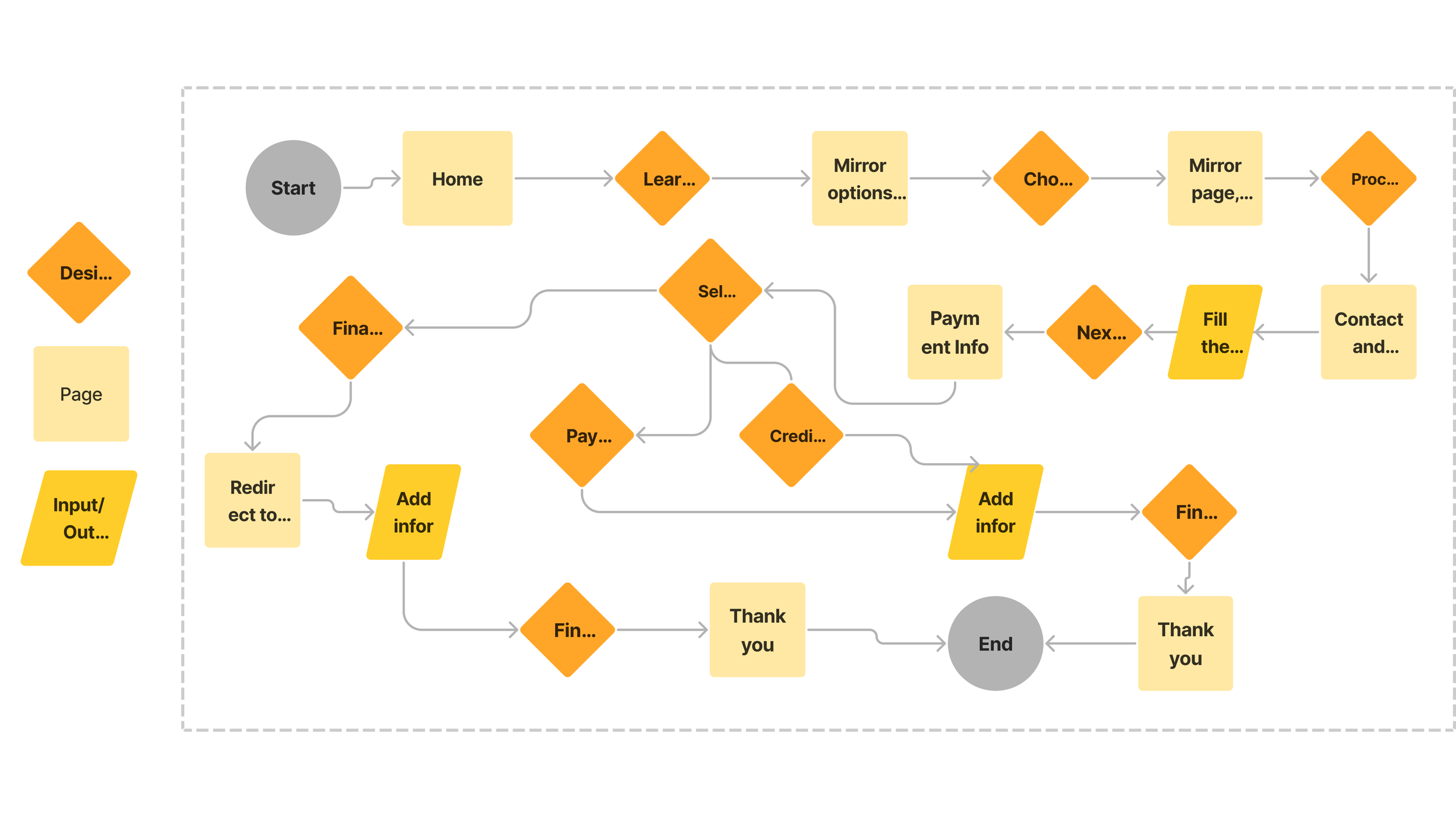
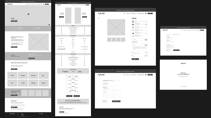
site map and user flow
after completing the ideation phase, including research, persona creation, and definition of the core problem, i moved on to restructuring the website’s information architecture and polishing the primary user flow.
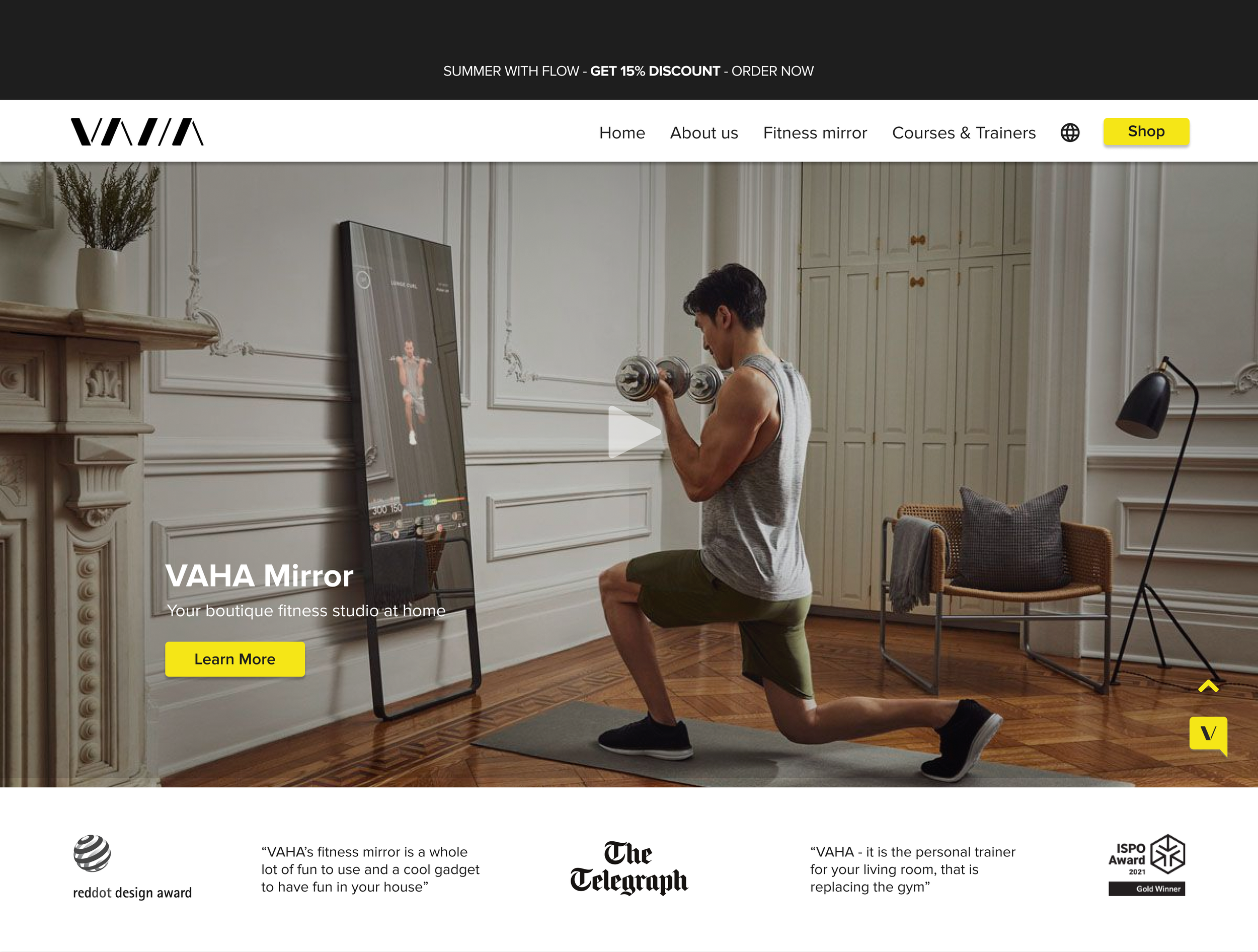
as key insights revealed that important informational and trust-building content was hidden within secondary flows and footer, i decided to add essential sections such as “about us” and “faq” to the main navigation and reorganized product information using clear ui hierarchy patterns. trust elements like certifications and awards were repositioned closer to header.
i also introduced a dedicated “fitness mirror” navigation item, allowing users to quickly access structured, in-depth product information directly from the homepage.
to reduce checkout friction, I added a progress indicator and conventionally structured input fields supported by progressive disclosure, making the flow feel clearer and more predictable.
the updated user flows were validated through usability testing to confirm improved clarity and navigation efficiency.
✹ ✹ ✹
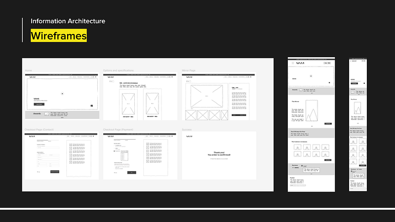
at the hi-fi wireframing stage i decided to enhance the visual appeal and user experience, i implemented several improvements:
added bright yellow cta buttons for increased visibility;
introduced a language switcher icon to cater to international customers;
included an up-arrow button in the bottom right corner for easy navigation from the footer to the top of the page;
added detailed mirror specifications using bullet points for clarity and highlighted the free membership offer;
developed a progress bar and input fields for different financing options. these options have a progressive disclosure and must be completed before activating the "pay now" button, reducing user friction.
figma prototype
more details about this project here.